
Solution Brief
The comprehensive Solution Brief provides a detailed ten-step strategy for addressing the underutilization of data in decision-making processes. The proposed approach emphasizes the importance of designing data presentations with intent and for clearly identified groups, particularly decision-makers who can effect change.
In this Solution Brief, you’ll be able to:
- Step 1: Build a well-rounded team with diverse expertise to enhance every stage of report development
- Step 2: Set a clear strategy by defining the change you want to achieve and aligning it with the priorities of your intended users
- Step 3: Identify decision-makers who have the power to act on your insights
- Step 4: Understand the values of your audience to make your data presentation resonate
- Step 5: Use relatable language and visuals to make complex data accessible and engaging
- Step 6: Establish a theory of change that connects your findings to actionable steps toward real impact
- Step 7: Incorporate compelling narratives that highlight the human impact behind the data
- Step 8: Provide actionable recommendations that go beyond data and give concrete next steps for decision-makers
- Step 9: Measure success by defining metrics that align with your goals and track your report’s influence
- Step 10: Create a distribution plan that places your report in spaces decision-makers already trust and frequent
These steps transform your data from static information into a catalyst for meaningful change. By following this proposed approach, you can enhance the impact of your data, making it more accessible, engaging, and actionable for those in positions to drive systemic change.
Reports regularly go unused, are misunderstood or are covered inaccurately by news media who don’t have the time or expertise to interpret nuanced points.
Data has a demand problem.
In 2014, the World Bank, which produces hundreds or thousands of reports each year, discovered something pretty remarkable: a third of the PDFs containing their reports had not been downloaded even one time. To be sure, those reports had been delivered to the countries and partners they were developed for, but the rest of the world met this work with collective disinterest. There are myriad challenges associated with using data to stimulate change. Reports regularly go unused, are misunderstood or are covered inaccurately by news media who don’t have the time or expertise to interpret nuanced points.
It’s tempting to ask, “How do we change the behavior of journalists?” or “How do we get decision-makers to use our data in their work?” But that’s the hardest way to solve the problem. It’s much easier to change your own behavior than someone else’s. To solve this challenge, invest in designing your work for the people you hope will use it. When NGOs and others generate reports, they often develop that report within their data team and then turn it over to strategic communications to build an engagement strategy. But if you flipped that and started by identifying your theory of change first and the role data has within that, what you produce will gain more traction and be more beneficial to those in a position to use it.
Data alone won’t make changes in the systems that require change. Abundant research shows that people rarely make decisions based on data. People act when they care and know what to do. Your reports will need to convey that the problem you’re identifying has solutions. It is critical that reports include compelling and credible data and actionable recommendations that are within the power of the decision-makers you’ve identified.
Here, we offer a ten-step approach to help you think through developing reports and resources to help those positioned to make decisions that drive change to do just that.
Step 1: Build Your Team
Ensure you’ve got the right people on your team to provide input and skills at different points in the development process. You’ll want to be sure to include researchers, people with direct knowledge of the problem, a graphic designer, a communications strategist, people with direct knowledge and relationships with those who will use the data in their work, an evaluator who can identify potential solutions and bright spots, but can also identify metrics of success for the project you’re launching and people who can provide critical context in the form of stories, imagery videos and charts.
Step 2: Set Your Strategy
Creating a product that makes a difference means that you have to start with an understanding of the change you’re working toward, know which decision-makers can make that change, understand and appeal to their values, and make that knowledge available within the spaces and habits that are already part of how they acquire new insights. When you think about a communications strategy, you may imagine a binder-sized book that takes months to write. You don’t have time for that. To simplify this process, use a set of four questions that will help you focus your effort, narrowly identify who you need to act and what’s important to them, and then identify specific ways to reach them.
Meet the four questions
- What do you want to happen that isn’t happening right now?
- Who has to act in order for that to happen? Which decisions do they need to make?
- What is most important to them, and what would they believe if they took action?
- Where is their attention now?
The questions are not as simple as they seem. Here are some factors you will want to take into consideration:
What do you want to happen that isn’t happening now?
Achieving your objective in different cultures and systems will require different kinds of changes. In some countries, you may need a change in laws. In others, you may need greater investment in enforcement. In others, you may shift local norms and behaviors within specific sectors of the community. Spend time thinking about which part of the problem you want to solve. You likely feel moral and professional pressure to take on every aspect of an issue simultaneously. But you will never have enough time, staff, or budget to do that. Identify a narrow, achievable objective that will make the greatest use of your resources.
Who has to act in order for that to happen?
Your first answer to this question may have been “decision makers” or “influentials.” That’s a good start. You need to know more about them, though. And being able to learn more about them starts with defining them more narrowly. Can you identify the elected officials who control the resources needed to address the problem? Maybe these decision-makers are staff in a Ministry of Labour or Commerce.
The most effective communication is tailored to a narrow group of people who can act on what you’re communicating with them about and provide them value. What decisions are they faced with each day? How can you provide data-driven insight to help them make those choices and feel confident in doing so? You can’t tailor your communication or provide value without defining and really knowing who you want to reach and, even more specifically, who among them is, in fact moveable.
What is most important to them, and what would they believe if they took action?
It’s tempting to think that people aren’t taking the action you want them to because they lack information. But it’s more often true that people don’t act because they don’t care or because they don’t know what to do. Now that you’ve identified who you want to act so narrowly that you may even know their names, you can find out what they care about. Once you know that, you can incorporate their values and goals into your strategy and identify actions that they have the resources, power, and support to take.
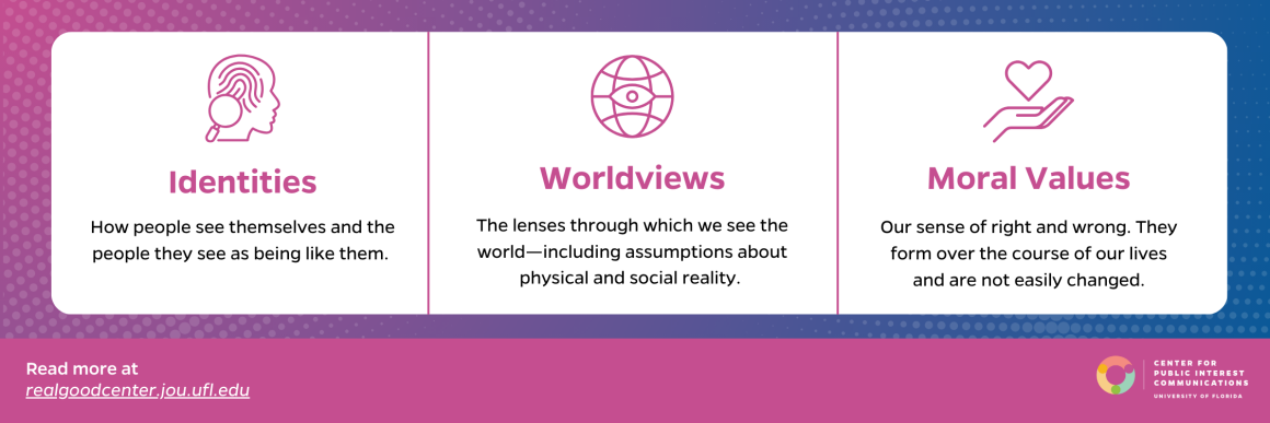
It’s critical to account for their identities, worldviews, and moral values.
Identities are how people see themselves and the people they see as being like them. We don’t have a single identity; we have several. Our identities are derived from things like our religion, favorite sports team, political party, and family role.
Worldviews are the lenses through which we see the world. They include our assumptions about physical and social reality. Our worldviews affect how we see issues like whether people should enjoy equal rights or philosophies like socialism and capitalism.
Moral values include our sense of right and wrong. They form over the course of our lives and are not easily changed. They are connected to our fundamental human emotions. They are often our reasons for taking action. Understanding the moral values, identities, and world views of the people whom you want to act to avoid making two dangerous assumptions:
- Given the right message, anyone might change their moral values, worldviews, or identities.
- That those you hope to reach share your moral values, worldviews, and identities.
People don’t tend to interrogate their moral values, identities, or worldviews, and they rarely change them. Instead of focusing your communications efforts on getting someone to shift their sense of right or wrong, focus on their most salient identity to the problem you’re trying to address.
For example, the animal rights movement has long focused their advocacy on getting people to see eating meat as wrong. Research suggests that this can be effective for women. However, research suggests that men see eating meat as an essential aspect of their masculinity. Trying to convince them that it’s wrong just won’t work. However, a recent film, “Game Changers,” took a different approach. The filmmakers followed elite athletes who had also adopted a vegan diet. The film makes a compelling case by appealing to a more salient identity–men’s desire to be seen as elite athletes as an expression of masculinity. As a result, Google searches associated with vegan diets spiked.
Make a list of things that are important to the people you’re trying to reach. Think about which ones can be achieved or advanced to address your issue.
Where is their attention now?
Figure out what your target audience is already paying attention to. Which news programs or outlets do they watch or read? What are their daily routines? How can you connect with them in ways that are consistent with the habits they already have? You might examine which social platforms they maintain a presence on and create content that will work exceptionally well on those platforms. Or look at reports they produce and how your data might fit within their reports.
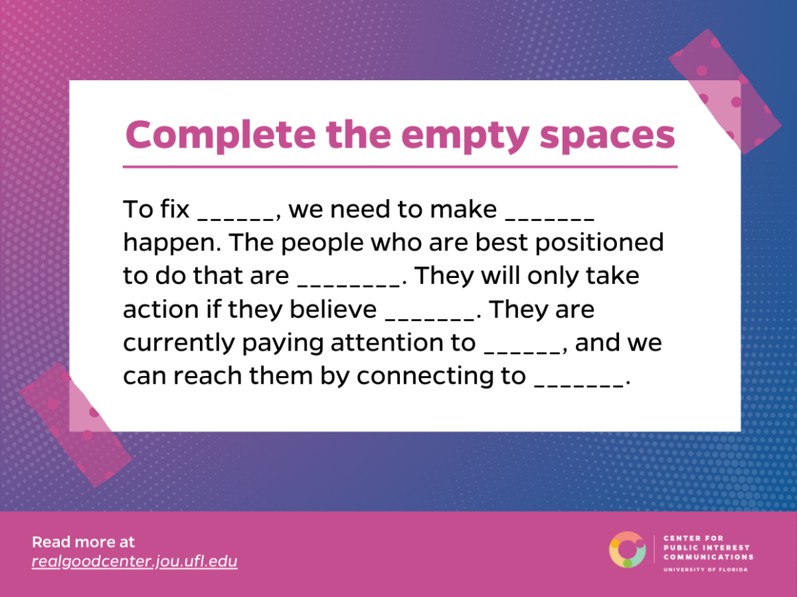
After you’ve completed the four questions, you will be able to complete the empty spaces in this sentence:
Start this process with a brief that captures your shared thinking. Capture the purpose, actors, voice, and other critical elements. This living document will evolve as you move through this process. Don’t write the brief alone: Make sure each person you identified as you built your team weighs in. Once you’ve completed a brief, you’ll find it easier to develop a budget that incorporates research, design, production, writing, and creative support. You’ll want to take note of where you may need to draw on external resources and talents for which you want to budget and also create a timeline with space for the inclusion of a range of perspectives and content and what will likely be a more complex approval process.
Step 4: Do Your Homework
Identify and learn about the people who are positioned to engage with and use the data, including local advocates, journalists, policy-makers, decision-makers, and people who can help you understand the local context. Most successful efforts work in some combination of six spheres of influence through which it is possible to affect behavior, opinions, and decisions.
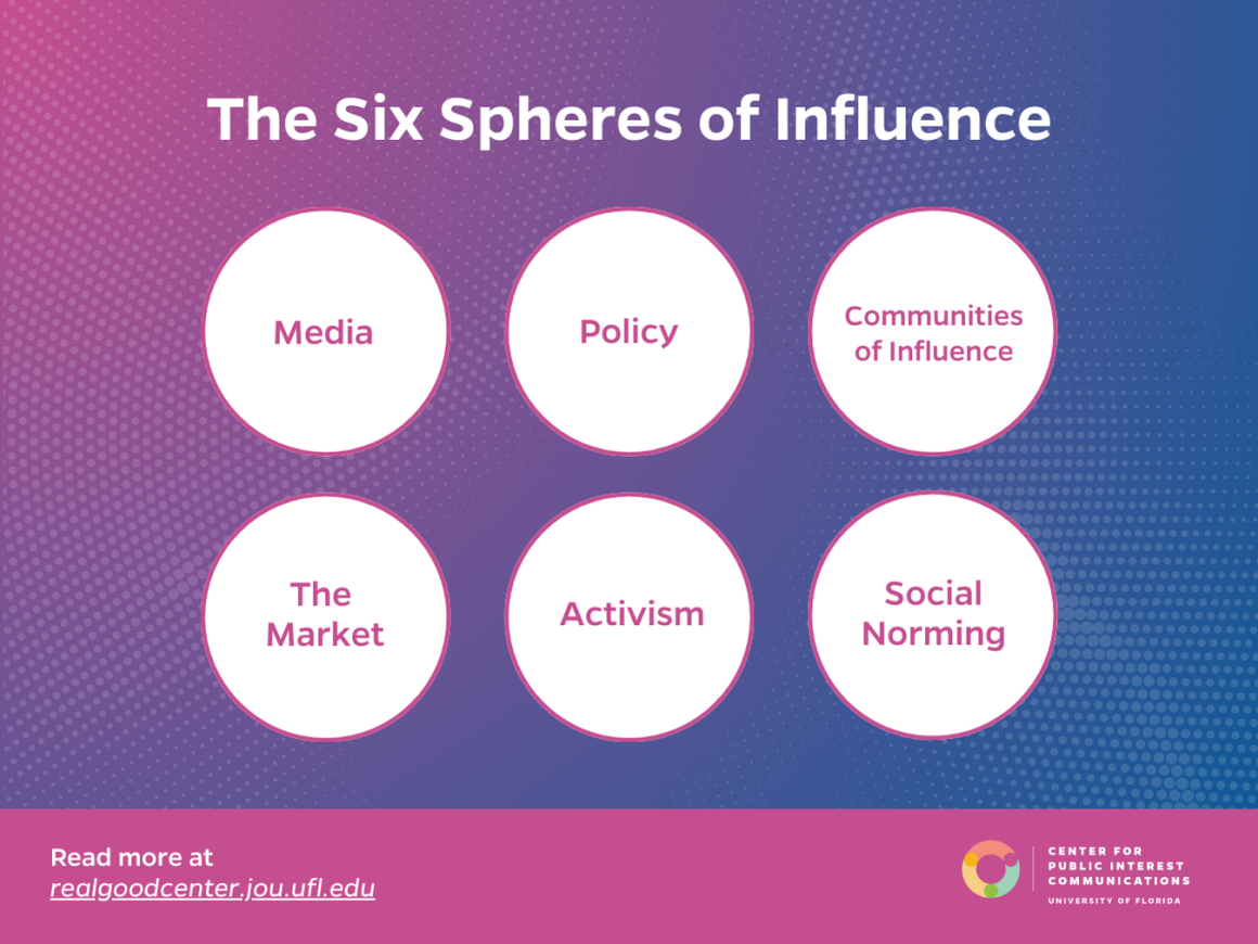
The six spheres include:
The role of media in affecting perceptions of the importance of an issue, establishing dominant narratives, or building the credibility of a particular perspective can’t be underestimated. In an age where mass media consumption is giving way to far narrower channels associated with social media, podcasting, and platforms that allow one to curate which outlets and ideas one is exposed to carefully, media are a less reliable and more complex tool for change.
The policy sphere refers to laws and government-funded programs that drive change. Policies can mandate individual behavior but can’t ensure that the particular behavior will be adopted. Working in the policy domain is complicated. Policymakers themselves can activate media or communities of influence to ignite change and are often members of communities of influence. It is also true that laws and regulations that aren’t enforced are meaningless.
For any issue, and in every region, there is an array of scholars, celebrities, activists, businesses, and advocates who engage with an issue and whose research, actions, or opinions shape how others see it. Their efforts will often affect others’ decisions to act on an issue. Communities of influence are broad and can be loosely or closely connected. Members of a community of influence include people who do not share an opinion or perspective on an issue.
Social change unfolds within larger economic systems, and business can have a significant role in furthering or hindering change. Similarly, activists can engage in activities that affect corporate values or brand equity. When advocates, foundations, and the federal government teamed up to take on the tobacco industry, one of the first lines of attack was to create policies that made it far more difficult to sell tobacco to children. It is impossible to ignore the agenda-setting roles and significant change that large corporate policies can engender.
Our behaviors are strongly affected by our perceptions of what people like us will do. When social norming efforts are matched with policy change, they can be an effective way to get people to avoid behaviors that are already illegal or to engage in more constructive behaviors. While the other spheres focus on creating a larger context for change, social norming focuses on getting people to adopt new behaviors at the individual level.
Activism is direct action on behalf of a cause, including protests, boycotts, marches, and political organizing. Activism’s effectiveness is always bolstered by a larger strategy that draws on the other spheres.
These spheres comprise a powerful arsenal for change, and choosing which spheres to work in is one of the most critical decisions a change strategist can make. Mapping the state of your issue in each sphere, both in terms of where the problem is now and where you hope it will be, can be a helpful step in honing your strategy. Change rarely happens in just one sphere, so you might also draw arrows to show how what happens in one sphere will affect outcomes in another.
Step 5: Design Your Research, Plan Your Engagement and find Your Format
Once you’ve identified the change you’re trying to make, who can make that change, and the systems that are creating the context for change, you may have found that you’ve identified research questions that are highly specific to supporting your strategy that you’ll want to add to survey protocols you’ve used before.
As part of this process, revisit the decisions people are in a position to make that could affect your issue. What data do they need to make those decisions? You can gather this information through interviews, focus groups, and observation. If others in the sector have conducted similar research, you might interview them. You could also use the approach used by franchises worldwide–look at where others working on the issue are communicating and go there, too.
Creating Your Engagement Plan
Through this process, you’ve spent a lot of time identifying specific people who are poised to take action. You’ve also identified their worldviews, moral values, identities, and existing habits. As you think through your plan for engaging those individuals, you’ll also want to consider which of the six spheres they work within. All of this will be invaluable as you create your engagement plan.
Identifying the Formats for Your Data
Once you know which platforms and constraints you’re creating for, you’ll have an easier time identifying the formats that will be most useful to the decision-makers you’re trying to reach. Our experience has been that decision-makers use data in smaller, “bite-sized” pieces, and rarely draw on complete reports. Breaking reports into smaller pieces and sharing them with others who will carry the message to decision-makers can also be effective.
Once you know which platforms and constraints you’re creating for, you’ll have an easier time identifying the formats that will be most useful to the decision-makers you’re trying to reach. Our experience has been that decision-makers use data in smaller, “bite-sized” pieces, and rarely draw on complete reports. Breaking reports into smaller pieces and sharing them with others who will carry the message to decision-makers can also be effective.
Step 6: Create Compelling Content
An infographic produced in 1787 included a single data point–the number 454–but it changed how the world saw the transatlantic slave trade forever. The diagram of the Brooks showed in heartbreaking starkness how 454 people were crammed and stacked onto the ship as it sailed from Africa’s Gold Coast to the West Indies. When abolitionist Thomas Clarkson wrote about the image in 1808, he said the “print seemed to make an instantaneous impression of horror upon all who saw it and was therefore instrumental, in consequence of the wide circulation given it, in serving the cause of the injured Africans.”
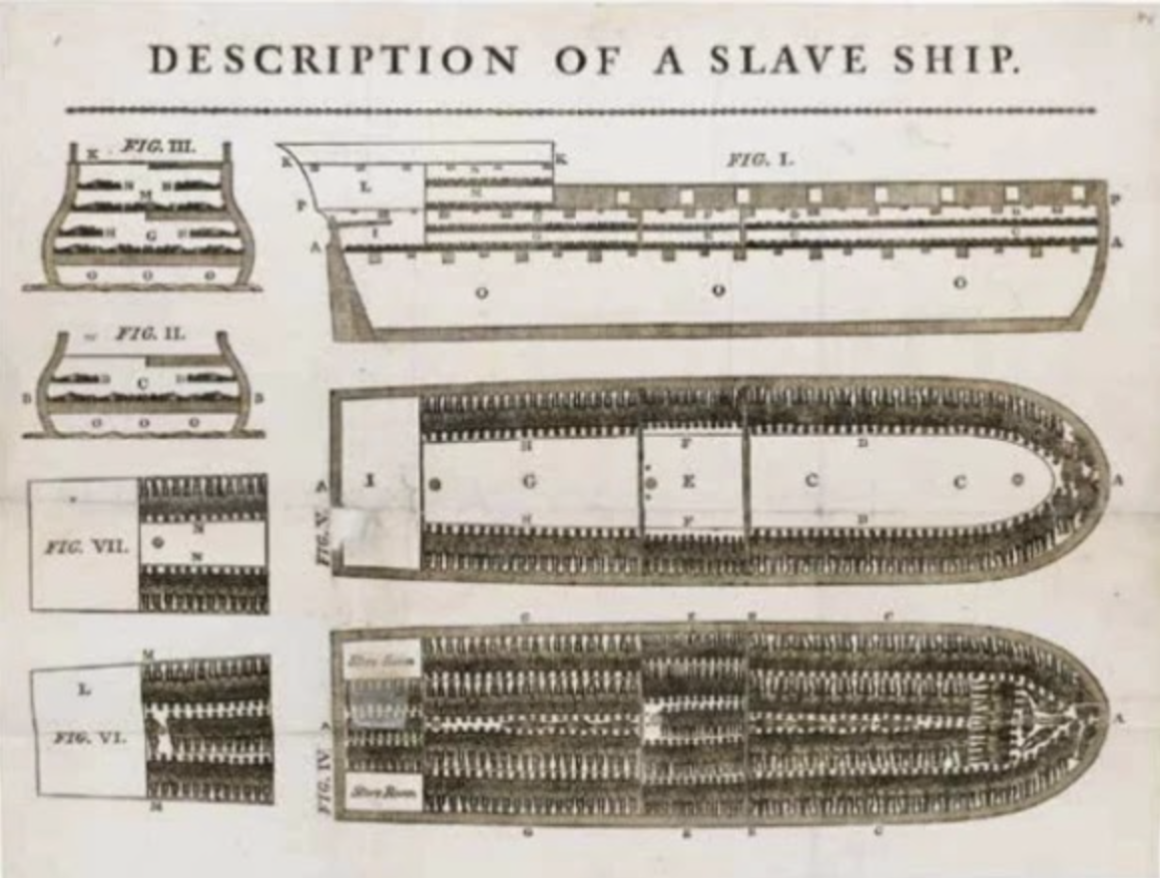
A well-crafted chart can be an effective way to engage someone who hasn’t yet made up their mind. When someone has made up their mind about something, the world’s most glorious chart can’t make them change it. Charts that counter a decision-maker’s most deeply held beliefs could backfire (Berinato, 2016). However, for people who are still deciding, charts may help them correct their misunderstandings (Berinato, 2016).
Before you start making charts, you have to decide who will use them, how you want them to be used, and what decisions might be made by those for whom you’re creating them. These should be the same people you identified in answering question 2 of the four questions. Consider these questions:
- What is their expertise? For those who may not have expertise in interpreting data, it’s better to make your chart simpler.
- Are they likely to have an emotional response to the data? Do they already have an opinion about the issue that might cause them to embrace or disregard the data?
- In what contexts might this chart be used? Will advocates use it to influence decision-makers when making a particular policy choice? Will policymakers use it to justify increased investments?
- How will your charts be delivered? Will they be part of a slide deck or dropped into a fact sheet? Or are they at the center of a social media post?
When you write an article, you can be sure that most people will read it sequentially. Charts are different, and research suggests that people process the elements in different sequences. Scholars are still learning what works best, and some of the available research relies on rarely used formats. However, we can borrow from other disciplines to offer some guideposts. There are just a few hard and fast rules for design.
1—Make your point inescapable
Your point should be obvious even if the people who read your chart aren’t experts. Focus on highlighting a single point and reinforce that point with a clear title and concise caption. While it’s true that people’s attention tends to dance around the elements of a chart, we’ll focus on the change in the trend line or the visual outlier first. Take care that those visual outliers align with your central point. In other words, what’s most important about your chart should also be what’s most interesting about your chart.
Leave out anything that doesn’t contribute meaning or understanding, and avoid excessive detail, visual embellishments, and dense layouts. In the words of Edward Tufte, a renowned data visualization scholar, get rid of all “chartjunk.” If you have multiple points to make, break them into separate charts.
Consider using your main point as the chart’s title. Use the caption to provide context, including factors that may be leading to this data point. If your chart shows a survey response, include the question people responded to.
2—Use emotion with intention
While data are considered cold or free of emotion, the people viewing it are not. The emotions you elicit affect how people will respond to your chart and the actions they take. For example, someone who has decided what they think about a topic may respond to being affirmed for those decisions.
It’s also true that there’s an “arithmetic of compassion.” Dr. Paul Slovic has written extensively about the paradox of caring–we feel for individuals what we can’t feel for groups. So, using terms like “one in four” may be more compelling than “one-fourth” or “25 percent.” Some chart designers eager to remind viewers that data are the aggregation of people’s lived experiences has successfully used scatterplots to represent the individual lives whose data is being represented.
3—Flex your credibility
Research suggests that people find charts that are easier to read more credible. Perhaps more importantly, they see the information as more reliable if they can easily understand the chart.
4—Know who you are creating for
Choose and design graphics with your viewers’ familiarity and knowledge of using graphics and their knowledge of the domain that is, knowledge about what the data represents in mind. (Kosslyn, 2006; Herald et al., 2016). If your viewers are less familiar with the topic and the data, provide additional direction to them about which features of the graphic are essential to look at in a caption or nearby text (Herald et al., 2016).
5—Make visual choices with care
Start by choosing the appropriate chart type, such as bar, scatter, or line plots. For instance, a bar chart is better for comparing among sections of a whole. While it can be tempting to use a pie chart, multiple studies suggest that pie charts can be difficult to read and draw conclusions from.
Use color with care and meaning. For example, using warm or “hot” colors like red, orange and yellow can signal danger, while green and blue are more soothing colors that signal growth. You’ll want to check in with regional experts to ensure that the colors you’ve chosen have the meaning you intend in the culture or region the chart will be used in. Our brains associate other kinds of meaning with color. For example, similar colors signify similar things, and color saturation will signify a progression of whatever it is you’re measuring.
6—Know that different cultures use different metaphors
Conceptual thought often makes use of cultural metaphors. As you choose your format, think about how people in cultures different from your own may draw different meanings from signals than you do. These kinds of differences are part of the reason it’s so important to include people on your project team who have lived experiences that are different than your own, and bring a diversity of perspectives to the work.
7—Incorporate context
Numbers mean nothing in and of themselves. We assign them meaning. Research–notably that of behavioral economist and psychologist Daniel Kahneman and Amos Tversky–suggests that providing context to data in the form of narrative is critical to others’ interpretations of that data. Without that narrative context, people will draw conclusions about the meaning of the data that support their existing worldviews and moral values.
Using data without context can be counterproductive in two important ways.
- Large numbers trigger pseudo-inefficacy. While large numbers may shock or horrify us, they also have the strange effect of making us believe that we ourselves can’t make a difference.
- Without context, data affirms our existing beliefs. Research by Rebecca Hetey at Stanford shows that using statistics to inform the public about racial injustice can backfire, leading them to support policies that exacerbate rather than ameliorate the problem. In one of her studies, she and a fellow scholar found that white Americans did not support criminal justice reform when they read statistics about how Black people are over-represented in prison.
Some forms of context to consider:
- Scale: Our brains aren’t good at processing or differentiating among huge numbers, so putting the number into a scale or schema that our brains can process can help people understand concepts.
- Trends: How has this indicator shifted over time? How might that window capture significant time spans, like shifts in government, treaties or high-level meetings?
- External factors that explain the change: What kinds of things happened that caused those shifts?
- Images: The images should support the point that’s made by the data.
- Story: What stories are available that might help your reader or viewer understand how the experience that the data documents unfold for real people and communities?
- Solution: How have others addressed the problems the data documents?
Research suggests that providing context to data in the form of narrative is critical to others’ interpretations of that data.
Curled from the work of Daniel Kahneman and Amos Tversky
Give yourself time to create, solicit feedback and reflect
As you create your charts, step back and look at them and share them with the team you established in Step One. Listen to their feedback, apply it and share it again to ensure that you’ve captured what you’ve intended to. Ask for feedback about each element of the chart: whether the font is legible, what meaning they took from the colors you chose, and finally ensure that the meaning they took from the chart is the one you intended.
Step 7: Make Your Calls to Action Actionable
What do you want people to do as a result of engaging with the information you’ve shared? Identifying a clear and meaningful call to action starts with a sound strategy like you outlined in step two.
Effective calls to action are:
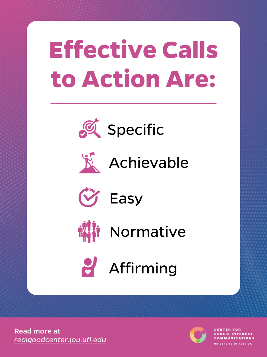
Specific. They translate your overarching goal into observable behavior that the actors you’ve identified can adopt. Specific calls to action increase psychological well-being by focusing people’s energy around a particular behavior.
Achievable. Self-efficacy is fundamental to strong calls to action–your actors need to believe their action will matter, and that they have the power to take that action.
Easy. People tend to avoid information that requires them to do something they don’t want or know how to do. Build your calls to action around their skill sets, within the power available to them, and use “nudges” to keep them focused on acting.
Normative. People’s individual behavior is heavily influenced by their perceptions of what people like them will do. Consider how your call to action will connect to their existing identities by citing effective action people in similar roles have taken around the world. There are three kinds of norms you can employ:
- Social norms, which are actions taken by people we perceive as being like us
- Moral norms, which identify particular approaches as “right” or “wrong”
- Transformative norms, which describe new approaches people like us are likely to take.
Affirming and aspirational. Effective calls to action affirm people’s identities by creating opportunities for people to be better versions of themselves.
Step 8: Make Smart Branding Choices
Your choices about applying branding to communications tools should be guided by a larger theory of change. Research on what’s called “Umbrella Branding” suggests that when people know and trust the credibility of one product produced by a brand, that will extend to new products.
Where choices about branding get more complicated is in developing other tools that rely on your organization’s data and stories–the kinds of tools you may develop to support research reports.
Here’s an example of a project that unifies story, data and brand effectively.
The University of California San Francisco developed this approach to sharing data and stories in partnership with the Bigger Picture and Youth Speaks to show the complex factors that lead to diabetes and obesity among young people. A particularly compelling example is a story written and shared by Tassiana WIllis. She opens with a compelling story, and the video closes with the organization’s brand and a deeper discussion of some of the key data that are linked to the story. If the story, data and branding appeared in a different sequence, they would be less compelling, and we might not be inclined to watch it at all if it were branded by the University’s research team.
Tassiana’s compelling story, which she tells herself through spoken word poetry, is authentic, powerful and moving. Once we understand type-2 diabetes through her authentic lens, we have a schema that brings meaning to the data when we hear it.
Another place where branding matters is when you’re disaggregating data to develop a data visualization or meme that you’re sharing on social platforms. In those cases, you’ll want to lead with counter-intuitive data, a citation for your organization, and link back to the more extensive data set. But leading with solid branding in those contexts is likely to lead to people scrolling past what could feel like paid content if it’s heavily branded. Research shows that heavily branded content almost never performs as well as culturally created content on these platforms.
There are three critical factors to consider when determining how heavily to brand a product you’re developing: authenticity, predictability, and credibility. Authenticity is essential to storytelling because a story has to feel true in addition to actually being true. Avoiding predictability is essential because when stories become predictable, we just check out. When it comes to sharing data or research, it’s critical to assert your credibility, especially at a moment when misinformation is everywhere.
Applying these insights:
- In sharing reports, data sets or dashboards that are likely to appeal to experts who already rely on your data to make decisions, lead with your brand to demonstrate the credibility of the research and rigor of the approach.
- In storytelling, lead with compelling individuals telling stories in their own voices. Include your brand at the end, after you have shared the story and the data to bring credibility, authenticity
Data literacy helps decision-makers make choices based on insights drawn from data rather than their own intuition.
Ann Searight Christiano
Step 9: Help People Use the Data
When a new drug becomes available, manufacturers don’t simply stock their warehouses and wait for people to order it. They send representatives to medical offices to train medical professionals when and how to prescribe the drug, help them understand its limitations, and think about which patients could most benefit.
Similarly, you may need to invest in helping people positioned to make a difference make use of your data.
Build data literacy. Data literacy helps decision-makers make choices based on insights drawn from data rather than their own intuition. Effective efforts weave data and individual stories together in ways that can help people take action that both feels meaningful and is meaningful.
For actors who may be less accustomed to using your data, you may want to translate it into scales that feel more relatable. One way to do this is to identify the pervasiveness of an issue in terms that feel meaningful.
For actors whose support and action is critical, you might consider hosting workshops and webinars that focus on helping a specific group decision makers interpret the data in the context of their own constituents and people they care about and work together to identify meaningful solutions drawing heavily on what has worked in other countries or regions or is starting to work in their own.
Additionally, these kinds of workshops and webinars create opportunities to collect feedback and insights that you can apply to future efforts.
Step 10: Learn What’s Working—and What Didn’t
Building the opportunity to learn and iterate throughout the process is critical to creating something that achieves your goals, and documents what you’re learning so you can apply those insights to future projects. You’ll want to think about both internal and external forms of documentation. Internal documentation helps you refine your ideas and document the process so you can learn from it over time. External evaluation will help you assess whether your project was effective in meeting your goals.
Here are some of the ways to think about learning from your work throughout the lifespan of your project:
At the outset –
consider whether there are particular external benchmarks you might want to capture that are specific and meaningful. These might include mindsets on an issue in a particular region or country that can be documented through surveys and sentiment analysis. It could be the number of elected officials who have expressed support. If you’ve been successful in pulling an evaluator onto your project team, they’ll have good insights about what to capture in terms of benchmarks at the outset of your effort.
Work with the evaluator to –
examine ways in which your theory of change can be tracked and measured over time. As you build out your plan for evaluation, you’ll want to draw on your answers to the four questions. Your answers for each will offer insights for how to measure success. For example, if you’ve clearly identified what it is you want to be different in a specific and observable way, you’ll know whether the legislation passed, dollars were invested in enforcement, or companies created new policies. If you’ve narrowly defined the people you’re hoping to reach, identifying whether you’ve reached and engaged them will be a simpler task.
And, if you’ve identified a clear, actionable and specific call to action, you’ll be able to observe whether people have accepted and acted on that call.
Throughout each step of your effort, you’ll want to test what you’re creating with people who are representative of those who will use what you’re building. Prototyping, seeking, and applying feedback is essential to building tools people will use, and that co-exist with their habits.
Here are some steps you can use to assess whether readers and viewers are taking away the right message. Some might require a budget or skill set, but most just include a few extra steps and careful observation.
Start by prototyping. Share your prototype with people who represent the kinds of people you hope to reach. Connect with the focal point for a country or region to identify which kinds of people are most likely to use the report in their work, and engage with them to get culturally relevant feedback. These same people could be the ones you interviewed in the early stages of the project.
If you can’t access them, the next best choice is anyone with different expertise, and for whom the concept you’re trying to present is new. Use their feedback to make your project clearer, tighten up the language and switch out imagery that may have been unclear. Feedback isn’t positive or negative–it’s just information.
You can also learn from what you have. Use website analytics, Google news alerts and image searches to identify similar products that have gotten high levels of engagement. Draw insights from each of these to iterate and refine what you’ve created, and track engagement with what you’ve built over time.
Once you’ve completed your project, you might consider conducting an after-action review. An after-action review is a systemized way of reviewing how you approached a project, the decisions you made along the way. In terms of internal documentation, you might also think about establishing a shared document where you and your team members can journal about the process.
The Center is here to help with your goals. Read about our services and how we work.
Or reach out today by completing the form above to tell us a bit about your project and inquire how we might help.

